By Ruth Rowland
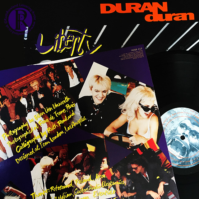
Back in 1990 I worked on the lettering for both the album sleeve of Liberty and the single Violence of Summer. My lettering can be seen on the back cover and inner sleeve of the album, not the title itself, this was already in place when I was commissioned.Despite being so many years ago, I have a vivid memory of sitting at a drawing board in Icon Design’s London studio, talking to Simon Le Bon about lettering. I even still have (and occasionally use) the dip ink pen he picked up to sketch out his ideas as he talked.
The sleeves themselves were designed by Icon, my role was to develop the lettering under their art direction. As with all jobs, I started out by producing a range of different style samples for the designers, who created mock-up sleeves to discuss with band and management. Once a direction was agreed, I developed the approved style and created the rest of the lettering.
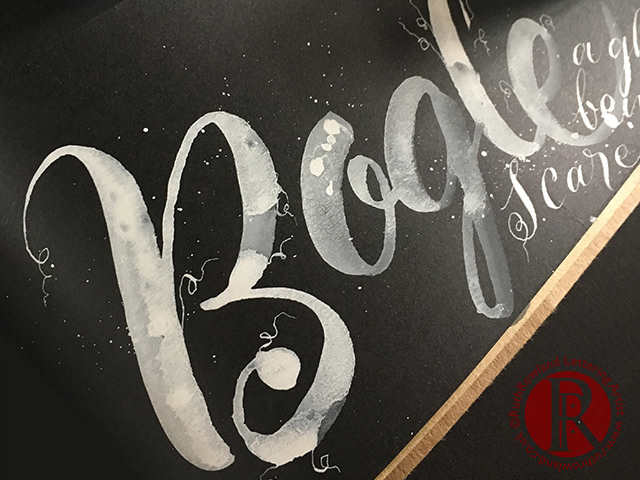
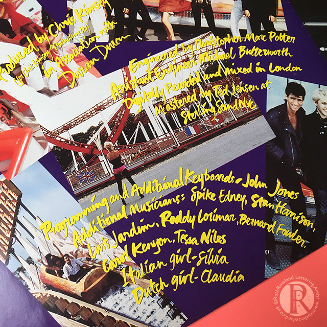
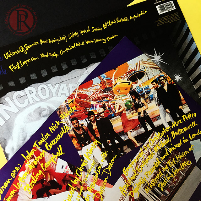
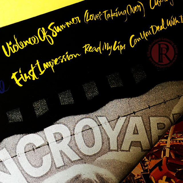
The brush lettering on the Liberty album is deliberately unrestrained and energetic to complement the bright, dynamic imagery. I worked much larger than it’s reproduced on the sleeve to keep the style casual and unselfconscious - something that’s a lot more difficult than you’d imagine. Looking back at the album, I feel it perfectly captures a moment in time, I still enjoy that irreverent, raw quality and the way the words move across the sleeve. I can certainly remember enjoying working on it at the time and hopefully that comes across.
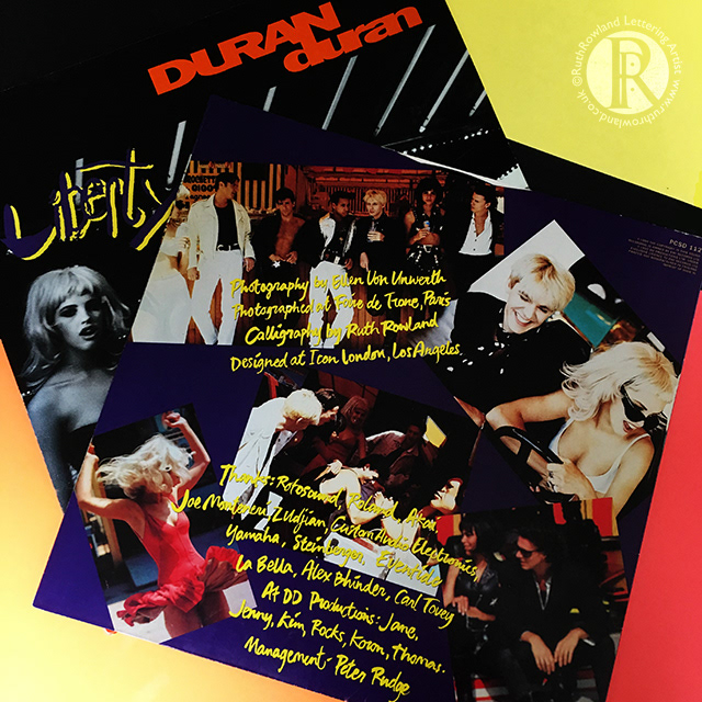
The sleeves themselves were designed by Icon, my role was to develop the lettering under their art direction. As with all jobs, I started out by producing a range of different style samples for the designers, who created mock-up sleeves to discuss with band and management. Once a direction was agreed, I developed the approved style and created the rest of the lettering.
The brush lettering on the Liberty album is deliberately unrestrained and energetic to complement the bright, dynamic imagery. I worked much larger than it’s reproduced on the sleeve to keep the style casual and unselfconscious - something that’s a lot more difficult than you’d imagine. Looking back at the album, I feel it perfectly captures a moment in time, I still enjoy that irreverent, raw quality and the way the words move across the sleeve. I can certainly remember enjoying working on it at the time and hopefully that comes across.
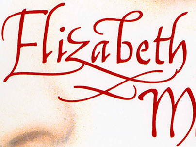
Hand Lettering for Duran Duran Liberty Album
Hand Lettering for Duran Duran Liberty Album
Hand Lettering for Duran Duran Liberty Album
Hand Lettering for Duran Duran Liberty Album
Hand Lettering for Duran Duran Liberty Album
Head back to the music folder to see more of my lettering on albums or take a look at my brush lettering for Chrissie Hynde ...