By Ruth Rowland
As one of the most successful syndicated comic strips ever, I was delighted to be asked to work on Brenda Starr's branding by J.J. Salem, author of her new mystery novels.
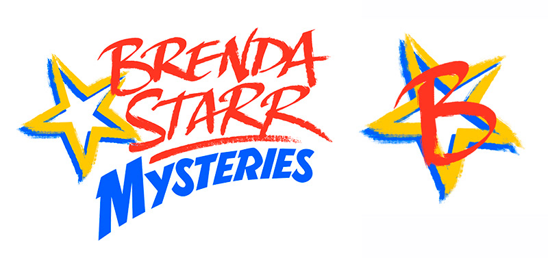
Brenda Starr’s origins in the 1940s had a big influence on the style of the logo. A dynamic combination of loose script and structured retro-inspired lettering kept the style fresh and contemporary with a nod to her comic roots. A simple star monogram offered a neat alternative to the full mark.
For continuity, this high impact lipstick-red lettering has been taken across the Brenda Starr Mysteries website and book covers.
Brenda Starr Mysteries Branding
If you'd like to see more of my branding for publishing, take a look at my collection of author logos ...